Table of Contents
- Item 1
January 26, 2026


Table of Contents
6
min read
Most brands chase AOV with discounts. At Angelus Direct, we lifted AOV by ~30% (from $30 → $39) without discounts, without a redesign, and without inventory chaos.
We did it by treating bundling as UX and product logic, not a promo mechanic. And that matters, because when you bolt bundles on top of a store, you usually get one of three problems:
The myth: bundles = discounts.
Angelus helped us prove something different: many brands think bundling means slashing prices, but it’s actually about pairing, positioning, and timing that create value without margin loss.
So the reframing is simple:
Bundling is a UX & product logic pattern, not a promo mechanic.

This also explains why: bundles fail not because the offer is weak, but because the decision point is wrong. If customers buy A + B to complete a job, the UI should sell the job, not the SKU. So, when flows follow real behavior, carts grow fast.
This is also how we run a weekly growth iteration rhythm: treat bundling as a UX + systems problem, ship small changes, and keep inventory and analytics clean as AOV climbs.
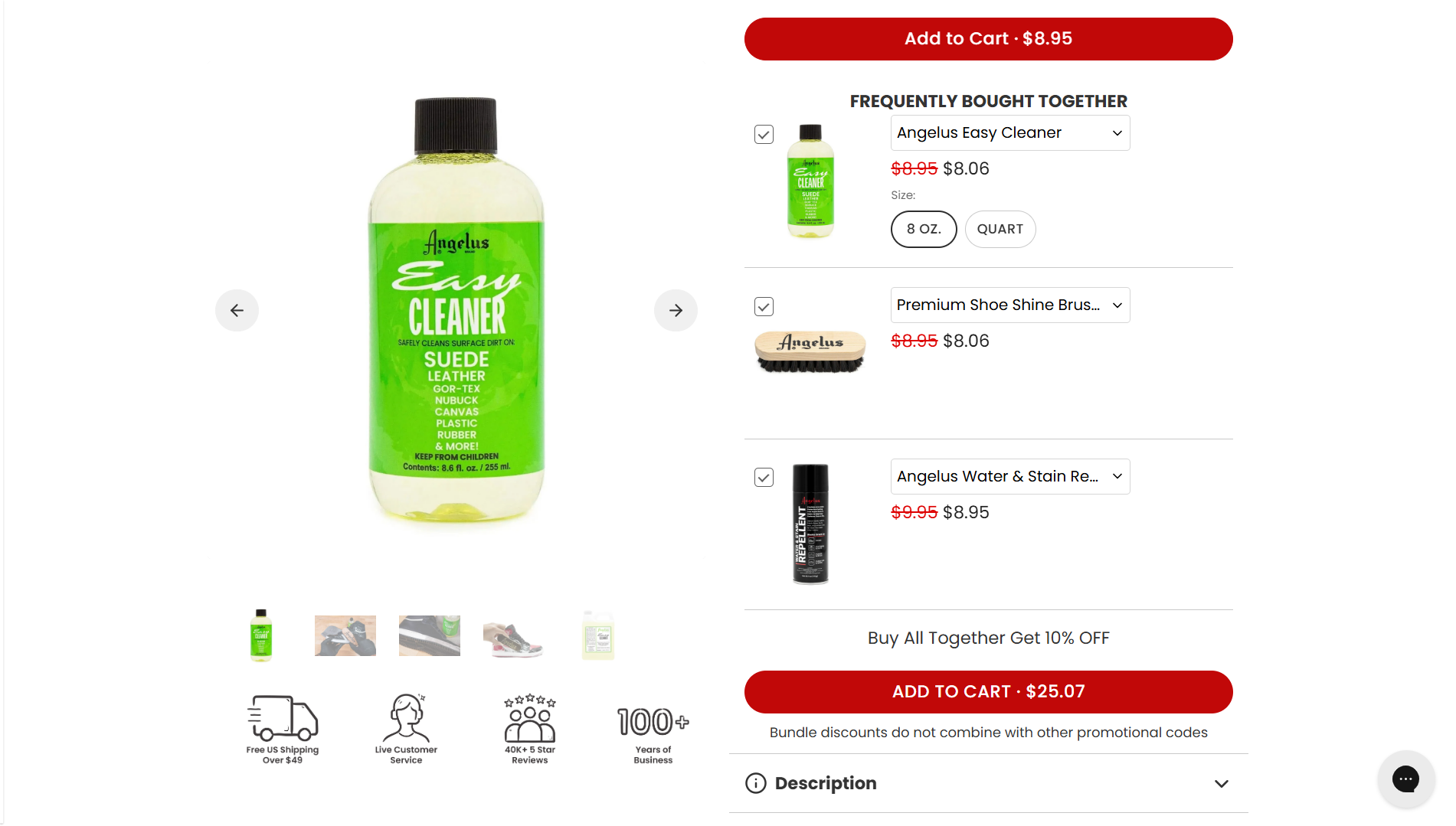
Angelus Direct is a century-old brand in leather paints and sneaker care, with strong demand and a loyal customer base. Yet even with that foundation, their online performance had stalled. Average order value was flat. Customers often bought products in sets, but the store wasn’t actively guiding that behavior.
That’s the costly default for many teams:
“Smart bundling” is the opposite of that. It starts from a UX-first idea:
Bundling is placement + pairing rules + clarity at decision points. Not markdowns. Not a last-minute overlay.
Smart bundling isn’t a trick. It’s an architecture lens, a system that respects three realities: operations, mobile behavior, and analytics.
Angelus knew bundling and upsells were an opportunity but they were rightly worried about hurting inventory tracking, slowing the store, or overcomplicating the experience.
Smart bundling keeps combinations logical and virtual:
To the shopper, bundles feel like ready-to-buy sets. To operations, they stay as clean, familiar line items.
Before we started, Angelus’ mobile UX was clunky, especially around variant selection and cart access.
Mobile is where the attach rate quietly dies: extra taps, forced page loads, and add-to-cart actions that throw shoppers out of their browsing.
Decision rule:
Angelus didn’t just need higher AOV. They needed to know why it went up. The only numbers that matter early: attach rate on hero SKUs, bundle acceptance rate by surface, and AOV lift segmented by mobile vs desktop. That meant:
We ended the engagement by delivering an architecture designed for iteration: ongoing A/B tests and new features like a future quiz and loyalty integration could be layered on without introducing noise into the data.
Angelus is a good stress test: high baseline performance, strong loyalty, and a complex catalog of paints and care products. You’re not “fixing a broken store,” you’re trying to unlock the next layer of growth.
What we observed:
The levers that moved AOV (without breaking UX):
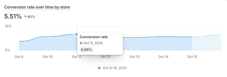
Publicly, here’s what matters:

From the client side, the impact was clear:
Being able to convert an already top-tier 3-5% site to some days almost 7% is what I love to see… Their team identified some easy wins and absolutely crushed it on the customer journey. – Tyler Angelos, CEO, Angelus Direct
And one more lesson from testing: Angelus tried multiple bundle layouts from carousels to inline blocks. The layout that won wasn’t the flashiest; it was the one users instinctively trusted.
These are principles you can apply regardless of your stack.
Treat placement as intent-matching.
Think of your store as a conversation: collections for “what looks interesting?”, PDPs for “is this the right choice?”, and cart for “am I done, or am I missing something?”
Bundling fails when shoppers hesitate. Micro-copy is where you remove that hesitation:
For Angelus, that clarity meant customers could complete multi-step projects with more confidence instead of second-guessing whether they had the right combination and backing out of the cart.
On mobile, every forced detour is expensive. Before optimization, Angelus’ mobile UX created friction around variant selection and accessing the cart. Afterward, shoppers could add from collections, move through PDPs faster when they needed context, and reach the cart with fewer taps.
Mobile rule: every detour has a cost. Smart bundling minimizes forced page loads, keeps add-actions scroll-native, and reserves PDP visits for moments where context actually changes the decision.
This is where many bundling projects quietly implode. To keep growth durable:
Angelus’ system was designed to be operationally stable from day one, so the team could keep iterating without dreading the reporting or warehouse fallout.
The last ingredient is rhythm. Smart bundling isn’t a one-off launch; it’s a loop.
High-performing teams treat bundling like a controlled system: one variable, one signal, one decision. They don’t “launch bundles”. They operate on a weekly rhythm where small changes compound, and real buyer behavior determines what survives.
The point wasn’t a giant roadmap. It was a weekly rhythm of small, compounding wins. Over time, that rhythm is what turned “we should bundle” into a repeatable growth system rather than a single project.
If bundling is a decision-point problem (not a discount problem), your next step is to locate the moments where customers could naturally buy two items and the moments where your UX pushes them back to one.
Our Shopify Consultant will help you determine the ways of increasing professional growth
%20copy.webp)