Table of Contents
- Item 1
March 23, 2026

.png)

Table of Contents
7
min read
Teams treat Shopify conversion rate optimization like a redesign project; on high-performing stores, the real lever is decision architecture inside the flow (especially on mobile).
But on high-performing stores, the real lever is usually less visible: decision architecture inside the journey, especially on mobile. When the flow forces shoppers to pause, re-think, or do extra work at high-intent moments, conversion stalls even if the pages look great.
In this piece, I’ll break down the three failure modes behind most plateaus, then turn them into five decision rules you can actually use. To ground the ideas, I’ll reference a Shopify Plus project, Angelus Direct, as a practical example of what these principles look like in the wild. The goal is to make it easier to choose where to start: the mobile collection add flow, PDP decision clarity, or cart reinforcement before you invest in design changes.
Most teams still approach Shopify conversion rate optimization as a design project:
But on Shopify Plus, the biggest gains are often less visible: decision-point clarity inside the flow. You don’t need prettier pages. You need fewer decisions at high-intent moments, especially on mobile.
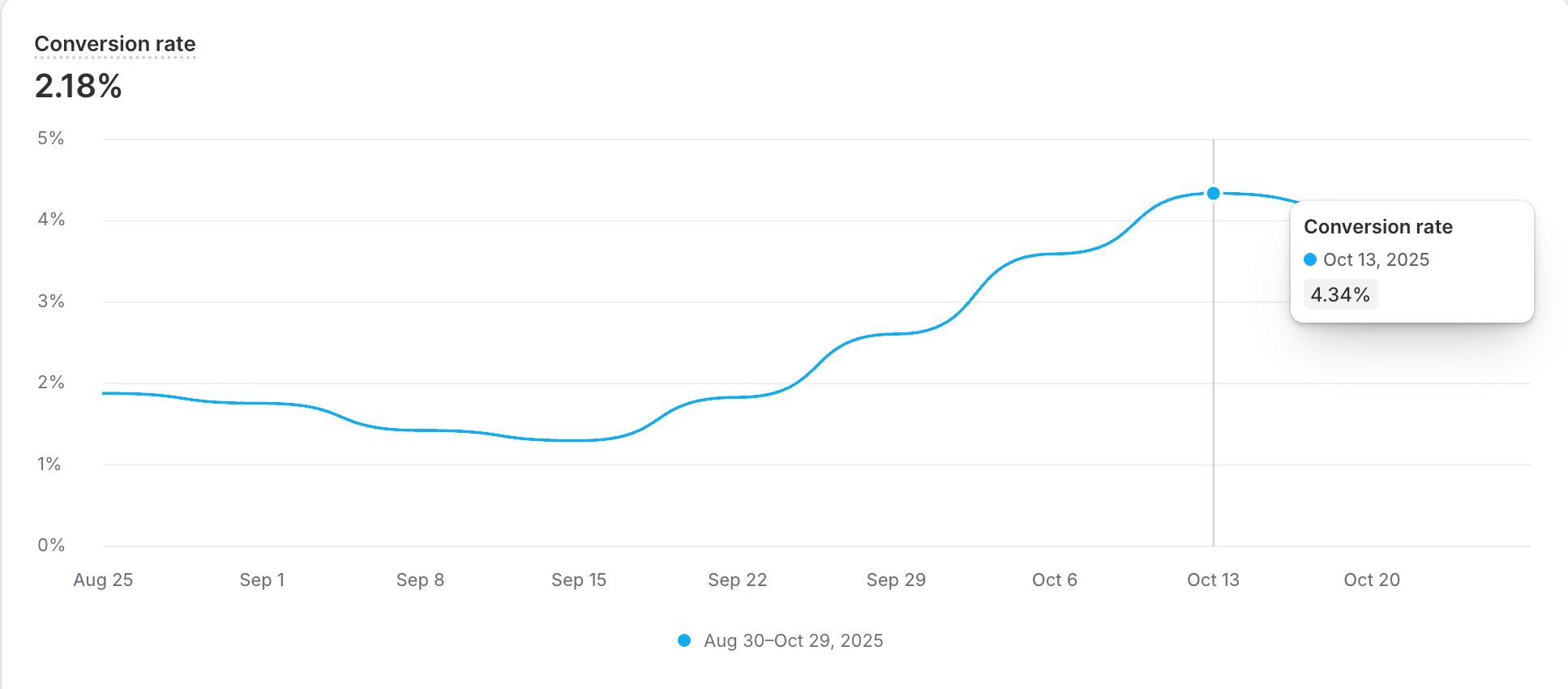
In Angelus Direct’s Shopify Plus journey, the impact showed up fast: ~4.5% conversion rate, some days approaching ~7%, and a ~30% AOV lift ($30 → $39) without a redesign. The first noticeable lift came within ~48 hours post-implementation.
What changed wasn’t the look of the store. It was the decision flow. We reduced friction in mobile product discovery with quick-add on collections, made PDP decisions clearer with Natural Pairings and Tiered Discounts, and reinforced the cart with Cartly-powered upsells (progress incentives and one-click add-ons).
The myth is simple: “If we want higher conversion, we need better-looking pages”.
The reality is more operational: strong stores plateau when the flow makes shoppers do extra work at high-intent moments, especially on mobile. This is also how we approach ongoing Shopify optimization: identify the hesitation points in high-intent moments, remove friction in small, durable steps, and keep performance and measurement clean.
Angelus Direct is a century-old brand with strong demand and loyalty. The stall wasn’t “no traffic” or “bad product”. It was missed guidance: customers frequently bought in sets, but the store wasn’t actively supporting that behavior, and mobile UX friction (variant selection and cart access) added hesitation right when intent was highest.
So why do high-intent sessions still drop on strong stores? It’s almost always one of three failure modes.
You can explain most conversion plateaus with three failure modes:
The point isn’t to add more prompts. It’s to reduce hesitation where intent already exists without creating operational risk (inventory, performance, reporting).
So what actually moves conversion on high-performing stores without redesigning pages? It usually comes down to five decision rules. If you get these right, you’ll know where the hesitation is happening and where it isn’t.
Collections, PDP, and cart are different intent moments. When the surface matches intent, it creates momentum.
Quick diagnostic: does your collection experience support “fast attachment” or does it force PDP-level decisions too early?
On mobile, product discovery was more friction-heavy. Browsing collections didn’t feel like “attach interesting items quickly”. It demanded more effort than the intent moment deserved.
We treated collections as a “fast attach” surface: fewer steps to add, clearer choices at the moment of selection, and less friction between discovery and commitment.
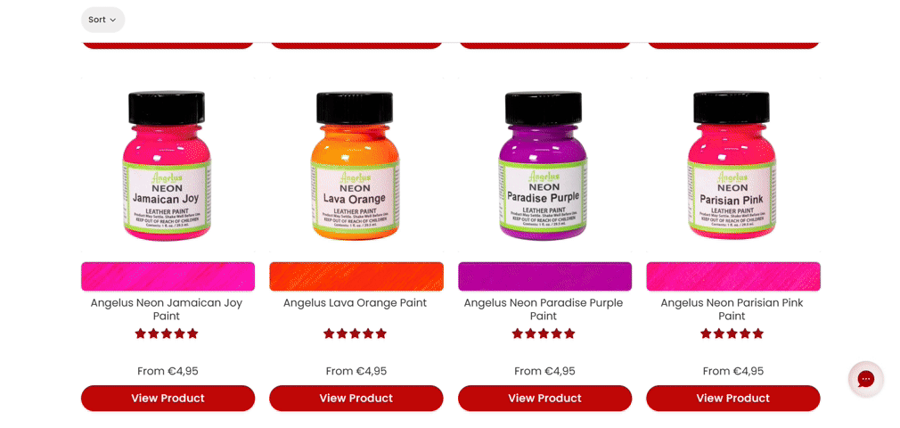
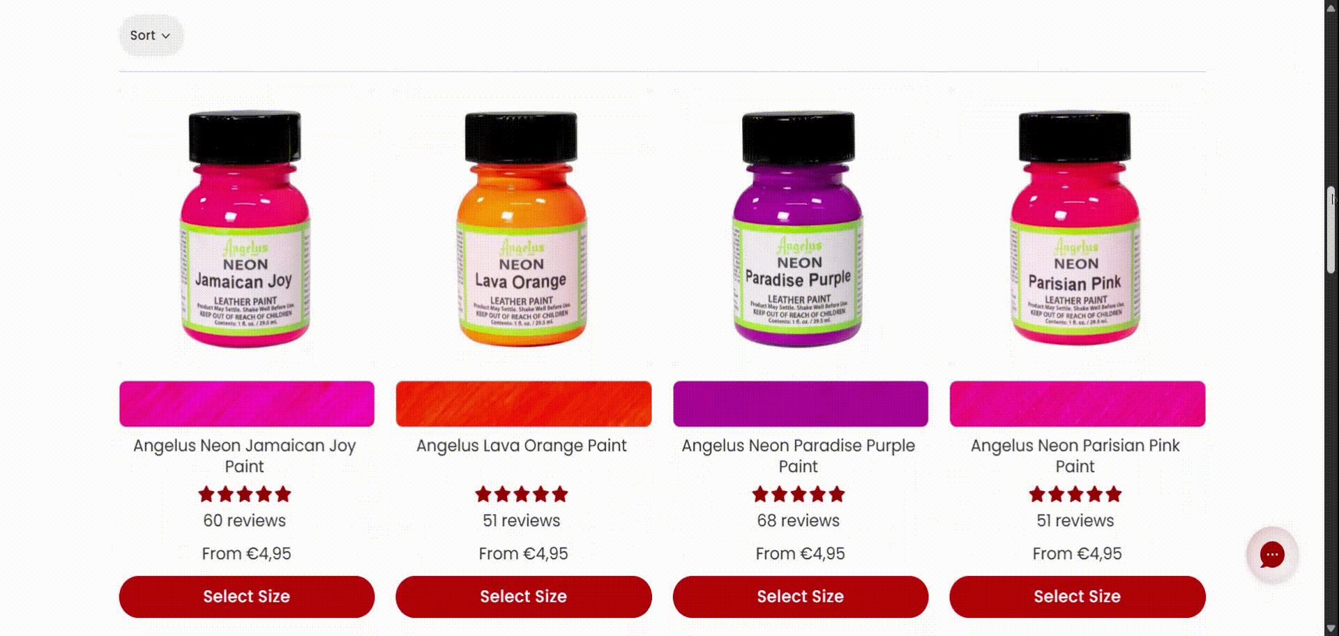
Match the surface to the job the shopper is trying to do in that moment. Don’t force “browse” behavior when the intent is “grab and continue”.
On mobile, conversion often dies from small friction at the action moment, pausing around variant selection and cart access that injects hesitation.
Here’s the tell: if a shopper has intent but needs to “re-orient” (variant → add → cart), you’ve created a hesitation window.
On mobile, the conversion drop usually happens when the shopper has intent, but the interface asks for extra effort: too many taps to select a variant, unclear confirmation after add-to-cart, or a hard-to-reach cart. The decision rule is simple: compress the path from intent → add → cart into as few steps as possible, and make the next state obvious so the shopper never has to re-orient mid-flow.
Every extra tap at a high-intent moment is a chance for doubt to enter. Protect the “commit” moments.
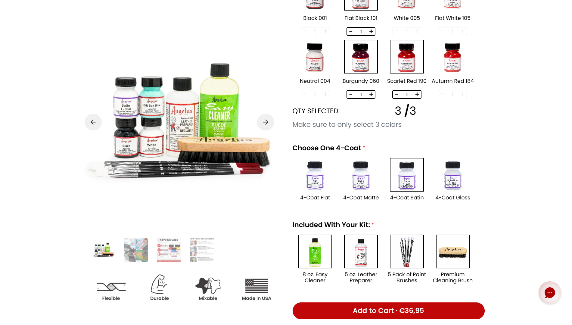
Bundling works when it feels like guidance: help customers complete the job with fewer decisions, not louder promos.
The test is simple: are you helping the shopper complete a multi-item job or just presenting a single SKU and hoping they assemble the set themselves?
When shoppers are doing a multi-item job, the PDP shouldn’t behave like a single-SKU catalog. The decision rule: reduce the number of choices the shopper has to invent on their own by turning “what people usually buy together” into guided, low-effort decisions, clear pairing logic, clear value framing, and curated add-ons that feel like completion, not noise.
In Angelus Direct, customers were already buying in sets, but the store wasn’t guiding that behavior. We anchored pairing around Natural Pairings and used Tiered Discounts to make “add the second (and third) item” feel like the default path, which contributed to a ~30% AOV lift ($30 → $39).
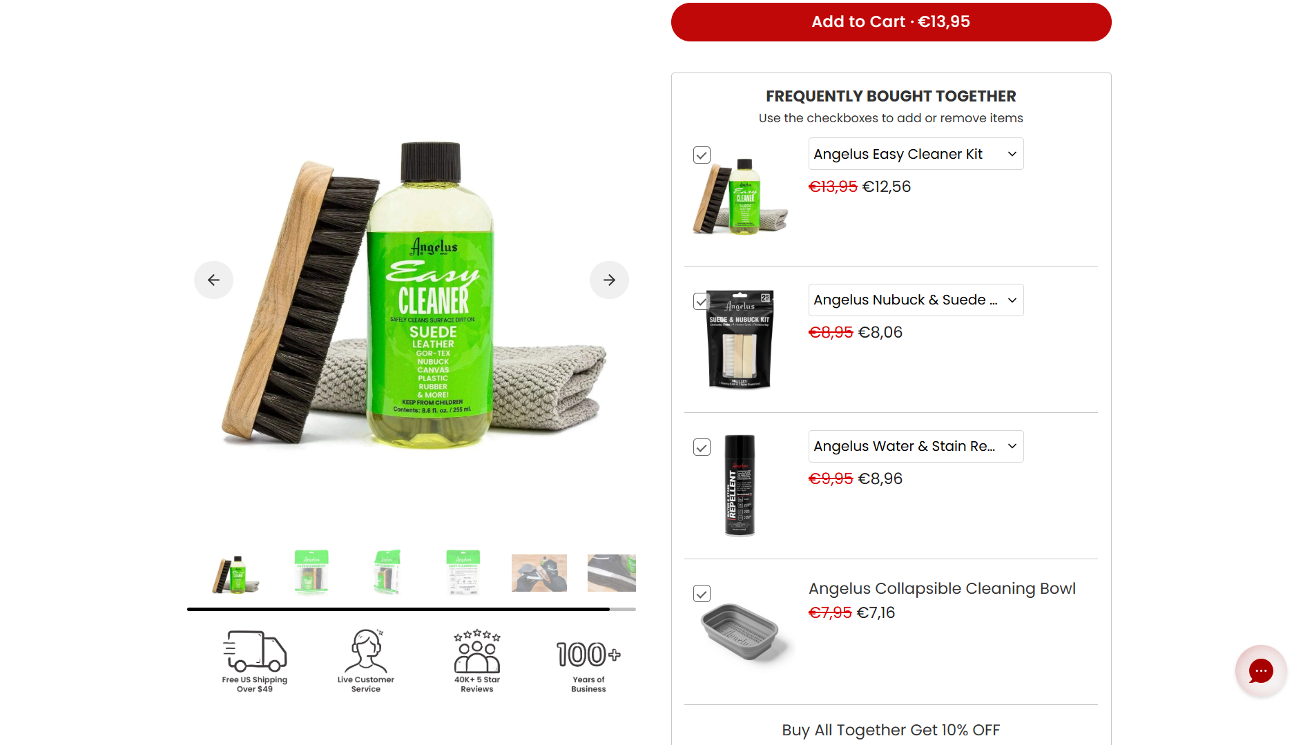
The best bundles don’t feel like upsells. They feel like “this is what people usually do next”.
The best-performing layout isn’t the flashiest. It’s the one shoppers instinctively trust. A useful check: does the layout feel instantly familiar and trustworthy, or does it make the shopper stop and interpret what they’re seeing?
What we saw in practice: novelty often introduces a hidden cost: it makes the shopper stop and interpret the UI. The decision rule is to prioritize instinctive trust over cleverness, clear hierarchy, familiar patterns, and predictable placement, which usually beats experimental layouts when the goal is commitment, not exploration.
In the Angelus Direct example, we tested multiple visual layouts, placements, and product groupings. In many cases, what we assumed would perform best didn’t. By analyzing buyer behavior, we iterated toward versions that felt clearer and more trustworthy, and that’s what ultimately supported a stable bundling system (psychology-aligned, but operationally safe).
We don’t optimize for “cool”. We optimize for clarity and instinctive trust, then iterate based on real buyer behavior.
Conversion lifts don’t compound if ops and measurement become fragile.
Risk: CRO wins decay when the system gets fragile, inventory tracking gets messy, reporting gets noisy, and performance drifts as scripts/apps accumulate.
The durability check: will this improvement still be clean in ops and analytics 90 days from now, or will it decay under technical debt?
The decision rule is: ship flow improvements only when they keep fundamentals intact, inventory, performance, and measurement. If a lift requires fragile logic, messy SKU workarounds, or accumulating scripts/apps, it won’t compound. It will decay.
In this project, we treated the implementation as a system, not a patch: cleaned up theme code, documented the workflow, and kept changes version-controlled so the team could keep iterating with reliable analytics and without creating operational noise. We also left an architecture that supports ongoing testing and future layers, like a quiz and loyalty integration.
You don’t need all five at once. You need to find the single surface where intent is highest, and hesitation is cheapest to remove, then protect ops fundamentals so the win compounds.
A quick proof checkpoint: when decision clarity improved across the flow, the measurable outcomes followed.
And the point isn’t the brand. It’s the pattern: when you remove hesitation at high-intent moments, strong stores stop paying the redesign tax.
Being able to convert an already top-tier 3-5% site to some days almost 7% is what I love to see… Their team identified some easy wins and absolutely crushed on the customer journey. – Tyler Angelos, CEO of Angelus Direct
If you believe conversion plateaus are usually flow problems, the benefit is clear: you stop paying redesign tax to fix issues that are actually decision-point issues.
The next move isn’t “another redesign” or “another promo.” It’s a diagnosis: locate the moments where customers naturally want to add a second item and the moments where your UX quietly pushes them back to one.
Start with the three decision surfaces: collection add flow on mobile, PDP decision clarity (pairing logic + variants), and cart reinforcement. Identify what’s blocking attach and which surface should be fixed first, then ship the smallest changes that reduce hesitation without creating operational risk.
If you want a structured way to run that diagnosis, the Playbook below helps you map your first three cross-sell decision points and the blockers that suppress attach.

Start with one surface, make one change, and keep fundamentals intact.
Guide, don’t guess. When flows follow real behavior, carts grow fast.
In 2010, Andrey founded MakeBeCool initially as a website development agency, but a discovery of the e-commerce world led to a complete retraining. With a newfound passion, he started collecting brand stories and case studies to empower e-commerce success. Beyond work, Andrey is a Lego Technic collector, a passionate snowboarder, runner, and fitness enthusiast. His active lifestyle extends to family time, where he shares his hobbies with his daughters.
View Author's PageOur Shopify Consultant will help you determine the ways of increasing professional growth
%20copy.webp)


